A Beautiful Mess. A MOPS Inspired Theme...

This year I volunteered to help with décor at our church MOPS group. May I start off by saying that this is one of the most amazing groups of women I have ever had the pleasure of serving, loving, laughing and doing life with...ever!?? Seriously.
 
Anyway, we decided to simplify décor this year by only doing four basic themes based on each season versus previous years of creating a different decorative theme for each meeting.
 
This year's national MOPS theme is "A Beautiful Mess: Embracing Your Story". I'll have to write more about that later...but, it really is a beautiful theme.
 
{PAUSE} Just a bit of backstory here before I go any further...
 
I was approached last year to lead a table at MOPS. With hesitation, I accepted and while the year was a challenge for me for many reasons, I am SO happy that I was able to lead in that capacity.
 
This year, I was asked by our group's coordinator to consider being a part of the hospitality team. At that time, I didn't even know if I wanted or would be able to be a part of MOPS at all with such crazy sports schedules, church involvement, etc. but after talking to the hubs and a bit of prayer, I decided to go for it.
 
Honestly, why wouldn't I want to do it? Having the ability to use my creative talents to bless other moms? Yes, please!
 
Sooooo...when I finally had the "go" from hubby and Jesus, I had about a week left to decide what the first meeting would look like. I then went back to the theme...
 
"A Beautiful Mess..." I was stumped for a few days. Yes, a few days that I didn't have.
 
Funny, there's always that moment that I am freaking out on the inside. I'm always waiting for that time that my brain just won't kick in and the ideas just won't make it through and everything fails. It hasn't happened yet...thank you, Jesus.
 
Then...it came. The "aha! moment".
 
I decided that I would take lots of naturally beautiful but messy elements add a few pops of color and go from there. Honestly, it still hadn't all come together in my mind but I had to get started. At that point, there were only a few days left. Insane.
 
I knew I wanted to use moss, wood, burlap...so I gathered those things and got on Pinterest, looked through old magazines...anything for inspiration.
 
I used sheet moss, wooden letters I purchased from a local craft store and some planks I found in our garage to create a sign for the welcome table. This is how it turned out. I really needed another board on top for the "a" but didn't have another and didn't have time to make a trip to the hardware store after my 20th to the craft store so I decided this was okay for now.
 
I used two different stains on the wood. Rustoleum in Kona and Varathane Driftwood. Both just happen to be my favorite stains right now.  


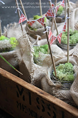
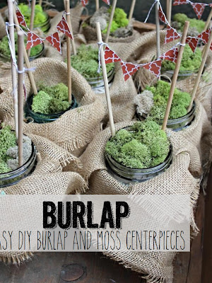
I am also in charge of centerpieces so I decided to use Mason jars {They will never get old}covered with burlap, filled with moss and topped off with mini buntings for a little bit of color on each table. I also added frames with an inspiration quote and all sorts of other goodies that I didn't get to snap a pic of so I will have to post those another time and hopefully upload a tutorial for some of it for those of you interested in doing some of this beautifully messy stuff!


A little bit of flower foam, moss, scrapbooking paper, dowels, burlap and a jar and voila! You've got a centerpiece. In keep with the Beautiful Mess theme, I added moss to each jar in different textures and shades.
 
 
Do you spy that blue jar? Yum. 
Hoping to post a few tips and tutorials on the sign and the jars within the next week!
 
So, come on back next week for detailed tips!


Hoping you're enjoying your week to the very last drop,

Thank you postcards (free printable)


Last weekend, friends and family threw me a sweet, rubber ducky themed baby shower. To thank everyone for their very thoughtful and generous gifts, I created a simple thank you postcard using Adobe InDesign.

I used the bunting from the shower and invitations as inspiration, and the postcard-style thank you leaves plenty of room for a personal, hand-written note. 


I had the postcards printed four to a page on heavy cardstock at Staples and they did the cutting too.


I've created a free printable version, available for download below. I've laid them out so you can print them four to a page (double-sided of course).


happy holidays


I dropped all of my Christmas cards in the mail yesterday, which is a little late for me, but still within Canada Post's suggested mailing dates. The 'happy holidays' greeting means it doesn't have to arrive before Christmas, right?

I usually make my Christmas cards, but with so many house projects on the go, I decided to try photo cards this year. We had lots of pretty wedding photos to choose from (thanks to our amazing photographer), and I figured this may be the last time we have photos of ourselves we actually want to share with others ha.

I'm really happy with how the cards turned out, but it felt a little weird to send cards without writing personal notes on each one. Do people even expect personal notes? What do you think of photo cards? 

Saying thanks

I love handwritten thank-yous and that's exactly what we wanted to give our wedding guests. I've noticed more couples using generic, pre-printed thank-yous, and although they look lovely, I really appreciate the extra effort that goes into a personalized note. Don't get me wrong, a thank-you in any form is much-appreciated, handwritten notes just give me that extra tingle. And since thank-yous are so much more fun to write when you've got pretty paper to do it on, I've rounded up a few of my Etsy favourites. Enjoy!

(spotted here)

(spotted here)


(spotted here)

(spotted here)


(spotted here)


(spotted here)

DIY wedding invitations


This blog is really a diary, a way to document the ups and downs as we turn our ugly house into a pretty home. But since our wedding is only a few months away, I can’t help but share a few details here.
This week Adam and I made it our mission to tackle wedding invites. We’re lucky enough to have two super-talented friends who agreed to design our wedding invitations for us. Once the design and wording was finalized (we gave them complete creative reign over the design, but I provided some wording suggestions), we took the invites to Staples for printing. We wanted to screenprint the invites - we loved the idea that each one would be slightly different - but decided to have the text printed to ensure that it was 100% legible. Adam did the screenprinting and it turned out great. The colour really pops and the paint adds a bit of texture to the invite.
The design is simple, but stylish and it perfectly suits the elegantly casual atmosphere we're going for with our backyard wedding. You'll notice that we decided to forgo any inserts, and opted instead to include the address of our wedding website, which has all the details our guests will need – where to stay, how to get around, what to do while they’re in town, etc. We've also asked our guests to RSVP by email, which I hope will be easier to keep track of than reply cards.
Adam and I are both really happy with how they turned out, and the fact that two of our closest friends designed and helped us make them is extra special.

Total Pageviews

Blog Archive

Popular Posts